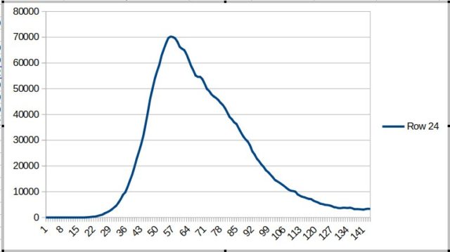
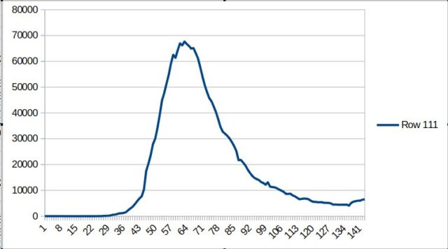
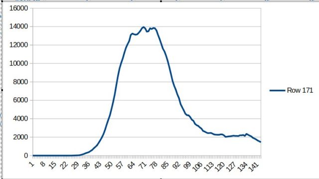
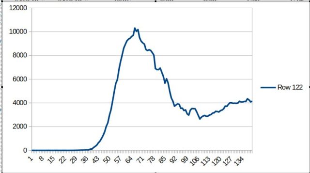
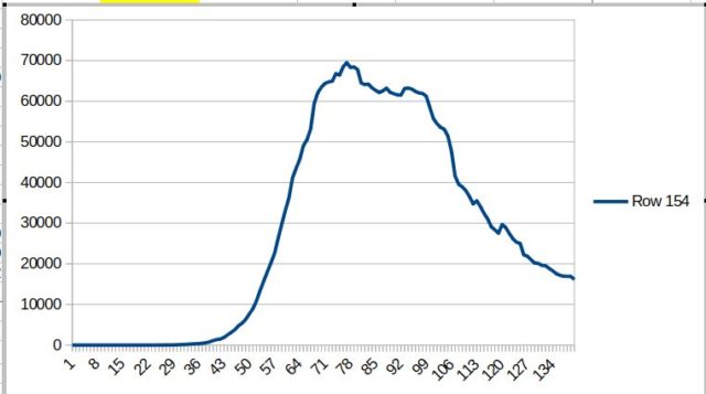
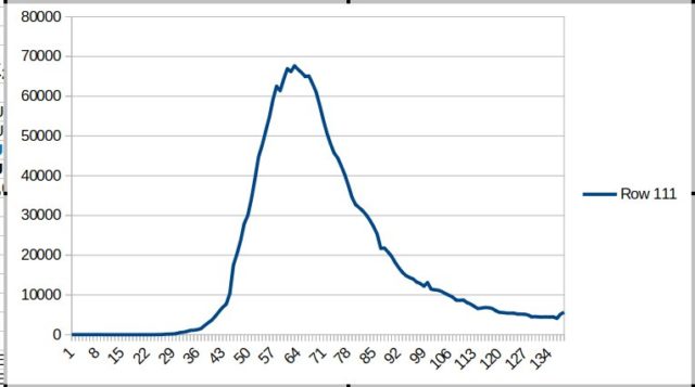
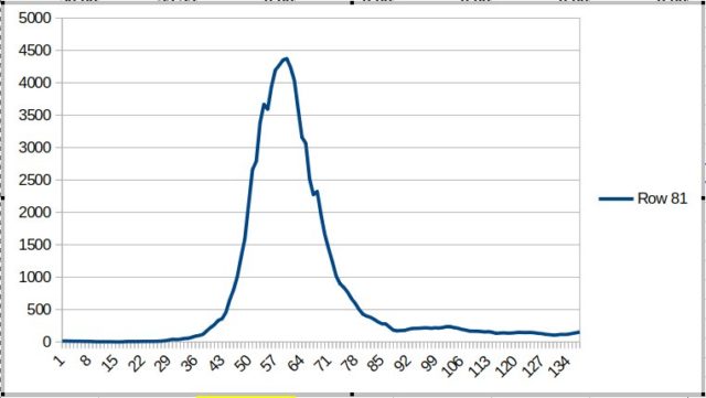
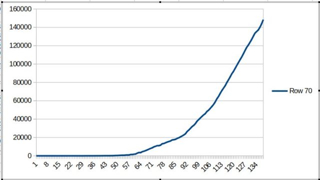
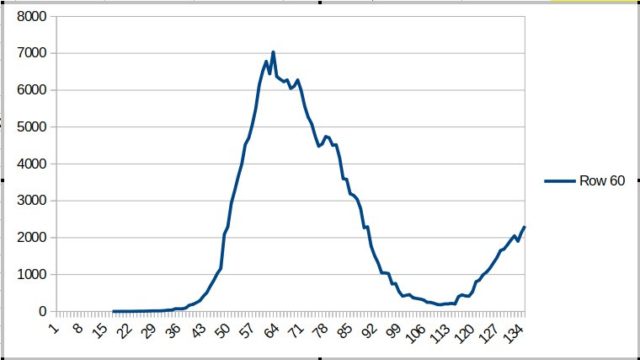
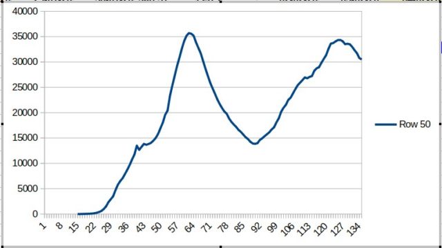
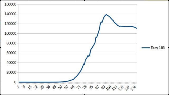
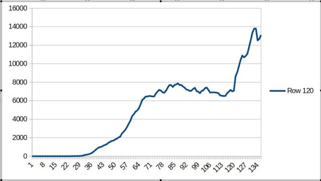
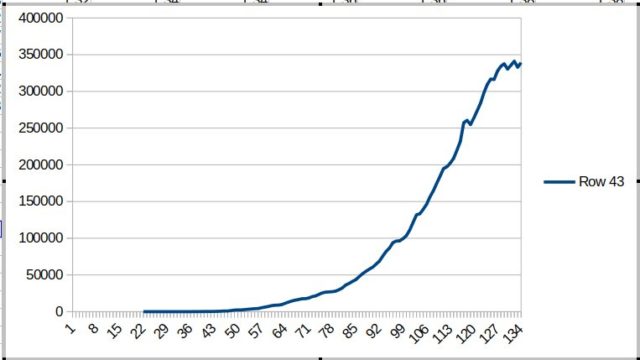
The charts on this main page contain my own approximation of the number of people (still) ill of COVID-19 in the particular country per day. This number is based on the figures published daily by WHO.
On the horizontal line at the bottom of the chart, you can find the days from 4 February (left) until the date that the chart was published (right).
Indicated vertically in the chart, is the probable number of people who still have corona in the Netherlands after proven infection and on the relevant day.
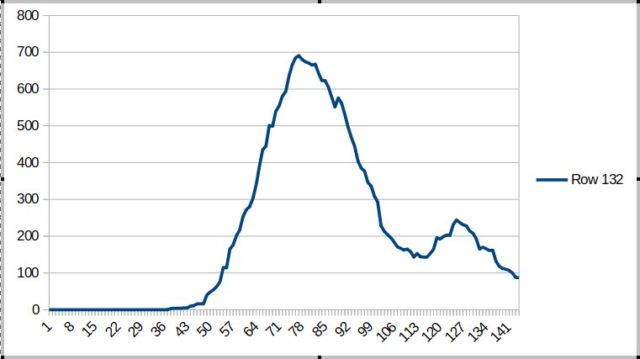
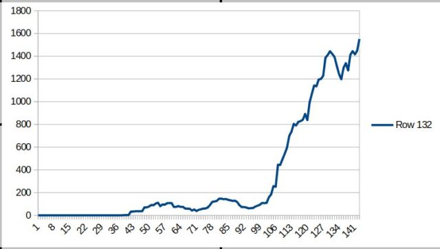
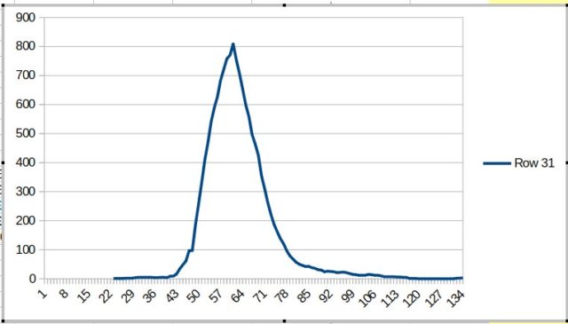
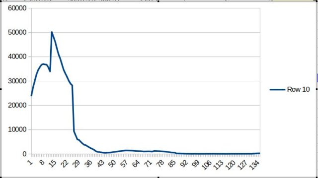
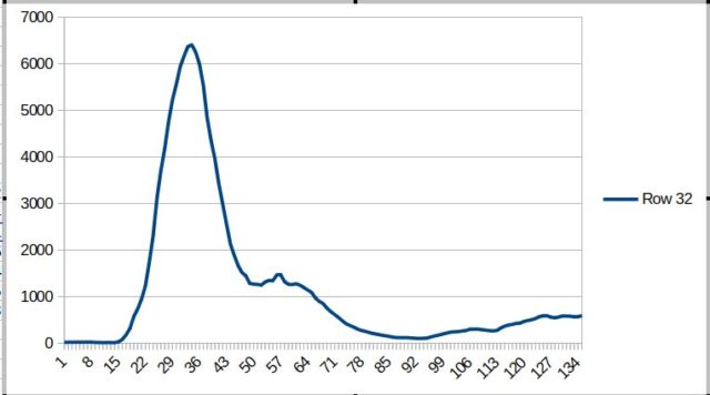
On each post you can click below to get a second chart.
The orange line in that chart shows the increase in percentage in the number of people, tested positive for COVID-19, compared to the day before.
The blue line shows increase or decrease in the number of patients (people tested positive and still ill), compared to the day before.
Reproduction Number
To get the reproducion number (R), you should take the number of the blue line on the chosen day, divide it by 100, and then add 1.