Charts are all for the Netherlands, from 5 Feb until 4 Oct 2020
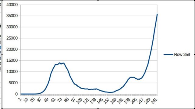
Number of people (still) sick on a given day. To the left of the graph you can see the maximum of last spring. The number of sick people is now almost three times the number of then.
—
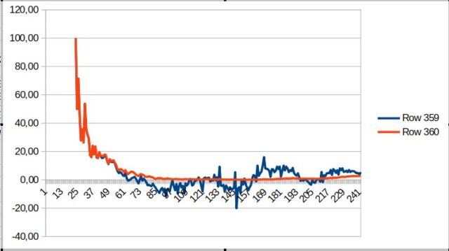
The reproduction number minus 1 on any given day (blue line). What is striking is that it seems that the reproduction is on its way back to below 0. In other words, in that case the numbers will decrease again. More than a month ago there was also such a dip, and before that the numbers rose faster than in recent weeks.
This could be an early sign that measures over the past two weeks are working. In any case, the situation seems better than a month or so ago.
—
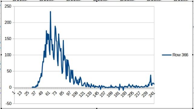
Number of deaths on a given day. This is higher than 2 weeks or so ago, but that is to be expected with so many people infected. The peak in the graph is an explainable peak for statistical reasons, which is of no great significance. What counts is the average line.